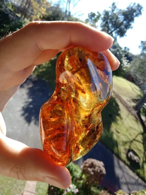
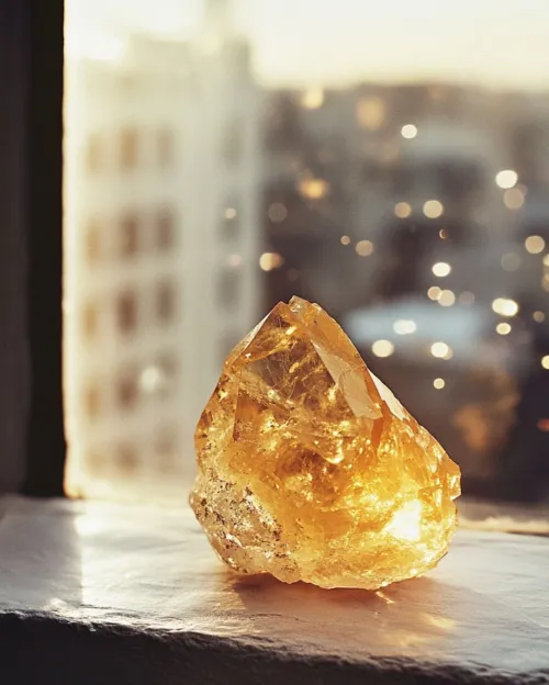
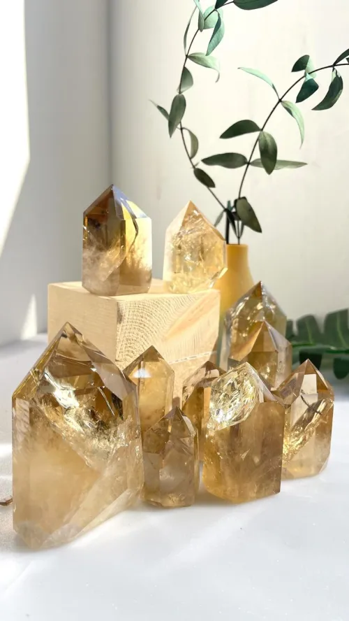
Citrine naturally occurs in a spectrum of yellow to orange hues, ranging from pale lemon yellow to deep amber or golden-brown tones, primarily due to trace iron impurities within its quartz structure. The saturation level varies significantly based on geological formation and may exhibit uneven color zoning, with untreated natural samples typically showing softer, earthier tones compared to heat-enhanced specimens.

You're scrolling through November birthstone jewelry, shopping for a friend's birthday gift online, or maybe you just inherited a yellow-tinged stone from a relative - suddenly you wonder: "Wait, what color is citrine exactly?" Is that yellow topaz maybe citrine? At this exact moment, it can feel oddly vital to know whether that golden stone is truly citrine or something else entirely. Beyond just hue names, you probably have questions about why light changes its appearance, whether this stone requires special handling, how jewelry settings play tricks with its color, or if darker always means better quality. Let's untangle all these practical realities together.
1. What’s the actual color range citrine can show?
2. How does its geological background create those yellow-orange shades?
3. Why does lighting make such a big change in how it looks?
4. What should you consider if buying citrine in real life?
5. How can you spot quality differences just by eyeing the stone?
6. What common myths about its color need clarifying?
From translucent pale lemon to rusty amber honey hues, citrine spans warmer parts of the yellow-orange spectrum. The crystal naturally exhibits hues spanning pale lemon yellow through vivid golden tones into deep amber, with saturation depth varying between individual stones.
That yellow-to-orange range you see comes mostly from trace amounts of iron impurities within citrine's quartz crystal structure. But it’s rarely one solid color: Larger specimens especially may show uneven coloring called zoning, where some areas appear deeper gold and others nearly translucent. Natural formations lean toward soft, earthy yellows—think dried wheat stems rather than fluorescent highlighter markers. Transparent cuts with fewer inclusions tend to display more consistent saturation, while milky quartz origins can create diluted pastel versions. Size matters too—bigger rough stones hold potential for richer oranges, though it doesn’t guarantee it.

Trace iron creates the signature yellows and oranges, but temperature and impurities during formation lock in the exact tone. Iron trapped as Fe³⁺ ions within the quartz during crystallization produces characteristic yellow-to-orange hues. How that turns out visually hinges on local conditions.
Geology leaves its fingerprints: Higher temperatures typically deepen color during formation, so stones from hydrothermal environments may appear richer than those formed through sedimentary processes. Those visible thermal history signatures pop up as unusually intense orange blotches surrounded by paler zones. And here’s a trade-off: Deeper-toned stones often originate from amethyst heated naturally underground, creating richer saturation but with higher risk of fading over decades. Natural citrine tends toward softer, muted shades precisely because it avoids those extreme temperature shifts.
Citrine can look subtly different under your kitchen bulb versus the sun: Expect warmer orange undertones indoors, cleaner yellows under natural light. Refractive properties cause noticeable visual shifts between lighting conditions.
The thing is, citrine interacts uniquely with light sources. Incandescent bulbs bring out rich amber warmth, while office fluorescents can wash out saturation. Daylight usually reveals the truest hue, especially north-facing windows with soft, indirect glow. But beware prolonged exposure—over years, intense direct sunlight can fade vibrancy. That said, daily wear effects are minimal; moisture doesn’t penetrate quartz enough to alter surface appearance. For consistent viewing when comparing stones? Check them together in two environments: Store spotlight for saturation depth and handheld near a window for undertone assessment.
When buying citrine, prioritize hue uniformity under different lights and decide whether you value natural earthiness or saturated brilliance. Visual consistency and setting type influence color perception the most.
Avoid surprises by understanding these variables: First, your stone's cut. Optimized facet angles play with light paths to either amplify depth or mute saturation. Rose cuts emphasize pale delicacy; brilliant cuts intensify fire with trade-off glare. Second, surroundings matter: Yellow gold settings boost gold tones while platinum/white gold allows truer color reading. Third, think longevity—citrine maintains structure better than softer gems but micro-scratches on high-ring pieces may diffuse light. Finally, manage expectations: Screen photos always distort reality; that vivid orange online may simply be monitor saturation tricks.
Look for consistent saturation without brown muddying the yellow-orange and minimal zoning patterns. Hue uniformity often correlates with formation method stability.
Instead of fixating solely on "dark means premium," scrutinize subtleties: Quality untreated stones exhibit gradual transitions rather than sharp color banding. High-clarity should showcase inner glow rather than cloudy dilution. Surface finish matters too—vitreous lustre enhances refraction while waxy feels dullish. Examine under magnification: Micro-graining along facets might indicate heat enhancement, whereas natural citrine can show irregular liquid inclusions. The thing to remember? Commercial grading often prioritizes even vividness, but many collectors value the complexity of natural variation. There’s no universal "best," only what resonates with your taste.
Not all dark yellow/orange stones are citrine, and deeper saturation doesn't inherently mean higher quality or natural origin. Hue purity and absence of brown undertones often influence perception differently across cultures.
You’ve probably heard: "Dark amber citrine is rarer and better!" That’s an oversimplification. Truly natural rich orange pieces are scarce, yes—but most intensely colored commercial stones are heat-treated amethyst. Neither is "fraud," but their formation histories differ. Brownish undertones? Usually signal less valuable material, regardless of saturation. And the "Madeira" label? While descriptive, the jewelry industry applies it inconsistently—sometimes meaning deep orange-red, sometimes referring to trade-grade from Brazilian sources. Truth is, personal preference matters more than arbitrary marketing tiers: Do you gravitate toward lemon chiffon softness or intense sunset fire?

If you take one thing from this, remember that citrine’s color lives on a mutable spectrum—its beauty often lies in nuance rather than arbitrary intensity. When choosing your stone, prioritize hue purity over saturation alone: Watch for undesirable brown/grey undertones under daylight testing. Always observe potential purchases in multiple lighting environments to understand how the stone responds to light shifts. And embrace practical compatibility: Softer yellows complement both casual and formal settings while vibrant gold needs bolder designs to balance brightness. At the end of the day, trust your own eye’s reaction to its character rather than marketing superlatives.

